Happy rainy Thursday from DC! Thanks SO much for all of your input on the writing project I’m working on. Your emails and comments have meant SO much as your opinion means the world. Thank you, thank you, thank you.
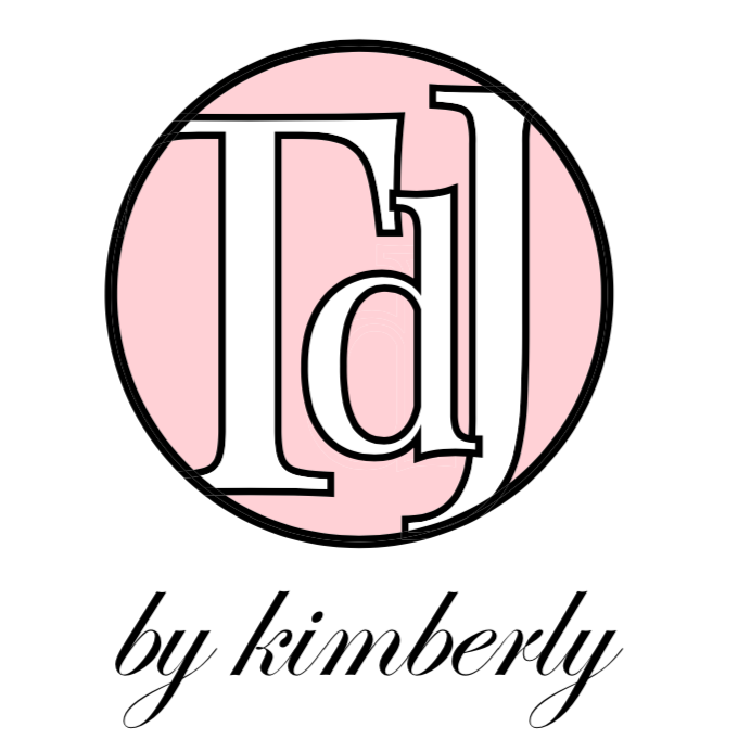
In other news, I’ve alluded to some changes coming down the pike with my locally-sewn, eco-friendly clothing line, TranquiliT. One part it is a new look and I’d LOVE your feedback on this project, too!
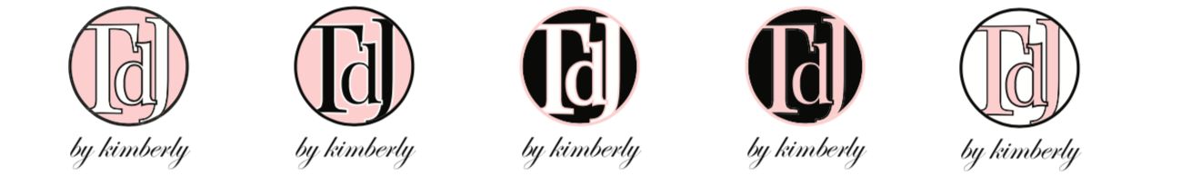
1. Which of the top logos do you like? See above, #1-5
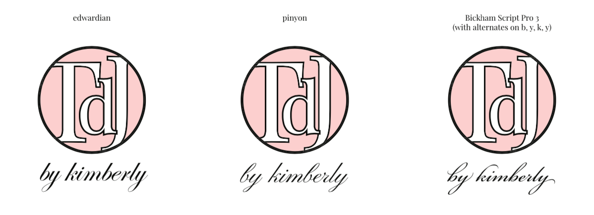
2. Which of the script fonts do you like best? See below, #1-3
Also, as a token of appreciation, one lucky responder will win a leopard-print scarf.
To enter to win, please share your vote for the logo and script number the comments below or send me an email by Sunday, February 9 at 11:59 pm ET. The winner will be announced here and on Instagram Monday.
Thanks HEAPS for your input! Your feedback means the world. Bisous. x
Thank you to EVERYONE for your votes and thoughtful feedback! Congrats to Karen E for winning the leopard-print scarf giveaway. I can’t wait to reveal the logo winner shortly. Thank you again! xo
I like logo #1 and script #3
Logo 4, script 1
Hard choice but I like logo #1 and font #2
I vote for #4 logo and #3 font
#2 and #1
How fun to be included in the design process! 🙂
My picks:
Logo: 1 or 5
Script Font: 2
Sincerely,
Caroline
1, 3. ❤️
I like #1 or #4 logo. and #1 font.
can’t wait to see what comes next!!
I like them all, but voting for logo 1 with script 2!
I vote logo #2 and script #2 💓
Logo 1 and script 2 get my vote!
Logo 5 and Script 1 get my vote!
Like #2 for the logo and # 1 for the script.
Logo #2 and script #1. Fabulous designs!
I like logo #1 and script #2 🥰
I’m a big fan of Logo 5 and script 3 🥰
Logo #4 or #1 and script #1 (edwardian).
I am partial to #4, with #2 a close second. As for the script, #2.
I think 2 and 4 pop most.
For scripts, 1 or 2. 3 seems a little hard (for me) to read compared to the others
#4 and #2
#4 and Pinyon
I love them all but if I had to choose #1 and #1
Pink background with black text. Script 2! Love your creativity!
Pink background with black text. Script 2! Love your creative!
#2
The color scheme is sexy 😉
and
#1
Your name pops at first glance
I like logo #2 but the fonts look similar but I like #3
Logo #2 is my favorite and script one! Can’t wait to see what is next for you it’s a pleasure to see someone grow into a new and more improved version of themselves
I like #4 (pink on black — good contrast) and script #3. The logo is adorable!
I love how you are transitioning and creating NEW things to serve you better!
Logo: #2 – pink background with black writing- great colors that match your brand, love the contrast, bold, easy to read/decipher.
Script: # 1 is my favorite – simple, feminine, elegantly casual.
I also like #4.
Hope this helps with your decisions!!
Xoxo,
Karen
You’re the lucky winner, Karen! Please email me your snail mail addy and I’ll get a leopard-print scarf out to you! x
Logo 4, script 1.
I’m most fond of your #2 logo and your #1 script. Change is hard but good. I’m looking forward to seeing what’s new for TranquiliT.
Also voting for #2 logo and #1 script (Edwardian).
Especially in smaller formats, I think these will be crisper and easier to read, while still being elegant.
these are all so good!! i vote for logo 4 and script 1! how exciting!!
Of the logos I love number 4, of the script I love 2.